Principal Components Analysis (PCA) is an algorithm to transform the columns of a dataset into a new set of features called Principal Components. By doing this, a large chunk of the information across the full dataset is effectively compressed in fewer feature columns. This enables dimensionality reduction and ability to visualize the separation of classes or clusters if any. In this tutorial, I will first implement PCA with scikit-learn, then, I will discuss the step-by-step implementation with code and the complete concept behind the PCA algorithm in an easy to understand manner.
 Principal Components Analysis (PCA) – Better Explained. Photo by RockyClub.
Content
-
- Introduction: What is PCA?
Part 1: Implementing PCA using scikit learn
-
- Building PCA with Scikit-learn
- Weights of Principal Components
- Percentage of Variance Explained with each PC
- Plot the clustering tendency
- How to get the original features back
Part 2: Understanding Concepts behind PCA
-
- Objective function of PCA
How to understand the rotation of coordinate axes
-
- What is Eigen Value and Eigen Vector
Part 3: Steps to Compute Principal Components from Scratch
- Import Data
- Step 1: Standardize each column
- Step 2 Compute Covariance Matrix
- Step 3: Compute Eigen values and Eigen Vectors
- Step 4: Derive Principal Component Features by taking dot product of eigen vector and standardized columns
- Conclusion
1. Introduction: What is PCA?
PCA is a fundamentally a simple dimensionality reduction technique that transforms the columns of a dataset into a new set features called Principal Components (PCs).
The information contained in a column is the amount of variance it contains. The primary objective of Principal Components is to represent the information in the dataset with minimum columns possible.
But, How to compute the PCs using a package like scikit-learn and how to actually compute it from scratch (without using any packages)? and importantly how to understand PCA and what is the intuition behind it?
I will try to answer all of these questions in this post using the of MNIST dataset. Structure of the Post: Part 1: Implementing PCA using scikit-Learn package Part 2: Understanding Concepts behind PCA Part 3: PCA from Scratch without scikit-learn package. Let’s first understand the data at hand.
Part 1: Implementing PCA using scikit learn
Dataset Description and Practical Uses of PCA
I’ll use the MNIST dataset, where each row represents a square image of a handwritten digit (0-9). The values in each cell ranges between 0 and 255 corresponding to the gray-scale color. Each image is of 28×28=784 pixels, so the flattened version of this will have 784 column entries. why use PCA? Practically PCA is used for two reasons:
- Dimensionality Reduction: The information distributed across a large number of columns is transformed into principal components (PC) such that the first few PCs can explain a sizeable chunk of the total information (variance). These PCs can be used as explanatory variables in Machine Learning models.
- Visualize Classes: Visualising the separation of classes (or clusters) is hard for data with more than 3 dimensions (features). With the first two PCs itself, it’s usually possible to see a clear separation.
Is PCA a feature selection technique? It is not a feature selection technique. Rather, it is a feature combination technique. Because each PC is a weighted additive combination of all the columns in the original dataset. More on this when you implement it in the next section. However, the PCs are formed in such a way that the first Principal Component (PC1) explains more variance in original data compared to PC2. Likewise, PC2 explains more than PC3, and so on.
2. Building PCA with Scikit-learn
Using scikit-learn package, the implementation of PCA is quite straight forward. The module named sklearn.decomposition provides the PCA object which can simply fit and transform the data into Principal components.
Load Packages
# Load Packages
import numpy as np
import pandas as pd
import matplotlib.pyplot as plt
from sklearn.decomposition import PCA
pd.set_option('max_rows', 500)
pd.set_option('max_columns', 500)
np.set_printoptions(suppress=True)
%matplotlib inline
Import Data
Let’s import the mnist dataset. For ease of learning, I am importing a smaller version containing records for digits 0, 1 and 2 only.
# Import Data
df = pd.read_csv('https://raw.githubusercontent.com/selva86/datasets/master/mnist_012.csv')

# Prepare X and Y
Y = df.loc[:, '0']
X = df.drop(['0'], axis=1)

print(df.shape)
df.head()
(3147, 785)  This dataset has 784 columns as explanatory variables and one Y variable names
 '0' which tells what digit the row represents. We won’t use the Y when creating the principal components.
Because I don’t want the PCA algorithm to know which class (digit) a particular row belongs to.
Rather, I create the PCs using only the X. Later you will see, we draw a scatter plot using the first two PCs and color the points based in the actual Y. Typically, if the X’s were informative enough, you should see clear clusters of points belonging to the same category.
Building the Principal Components
Let’s first create the Principal components of this dataset.
First, I initialize the PCA() class and call the fit_transform() on X to simultaneously compute the weights of the Principal components and then transform X to produce the new set of Principal components of X. This I am storing in the df_pca object, which is converted to a pandas DataFrame.
# PCA
pca = PCA()
df_pca = pca.fit_transform(X=X)

# Store as dataframe and print
df_pca = pd.DataFrame(df_pca)
print(df_pca.shape)  #> (3147, 784)
df_pca.round(2).head()
 The first column is the first PC and so on. This dataframe (
df_pca) has the same dimensions as the original data X.
3. Weights of Principal Components
The pca has been built.
The pca.components_ object contains the weights (also called as ‘loadings’) of each Principal Component. It is using these weights that the final principal components are formed.
But what exactly are these weights? how are they related to the Principal components we just formed and how it is calculated?
Well, in part 2 of this post, you will learn that these weights are nothing but the eigenvectors of X. More details on this when I show how to implement PCA from scratch without using sklearn’s built-in PCA module.
The key thing to understand is that, each principal component is the dot product of its weights (in pca.components_) and the mean centered data(X). What I mean by ‘mean-centered’ is, each column of the ‘X’ is subtracted from its own mean so that the mean of each column becomes zero.  Let’s actually compute this, so its very clear.
Step 1: Get the Weights (aka, loadings or eigenvectors).
# Principal Components Weights (Eigenvectors)
df_pca_loadings = pd.DataFrame(pca.components_)
df_pca_loadings.head()
 Each row actually contains the weights of Principal Components, for example, Row 1 contains the 784 weights of PC1.
No need to pay attention to the values at this point, I know, the picture is not that clear anyway.
Step 2: Compute the mean centered data.
X_mean = X - X.mean()
X_mean.head()
In above dataframe, I’ve subtracted the mean of each column from each cell of respective column itself. So the mean of each column now is zero. 
Step 3: If you go by the formula, take a dot product of of the weights in the first row of pca.components_ and the first row of the mean centered X to get the value -134.27.
This equals to the value in position (0,0) of df_pca. Do refer back to the pic in section 2 to confirm this.
# Compute PC1 for row 1.
np.dot(df_pca_loadings.loc[0, :], X_mean.loc[1, :])
#> -134.272
Likewise, all the cells of the principal components matrix (df_pca) is computed this way internally.
4. Percentage of Variance Explained with each PC
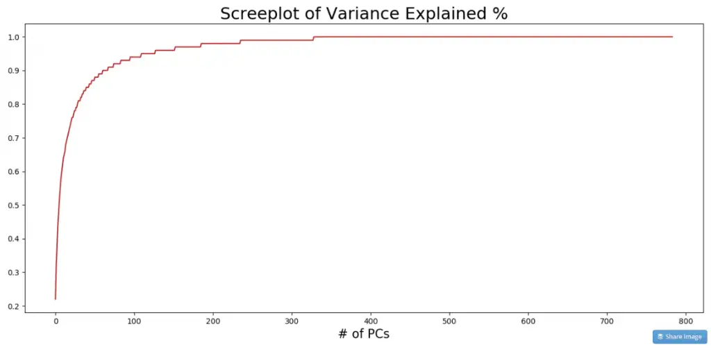
The PCs are usually arranged in the descending order of the variance(information) explained. To see how much of the total information is contributed by each PC, look at the explained_variance_ratio_ attribute.
print(pca.explained_variance_ratio_.round(2)[:10])
#> [0.22 0.1  0.06 0.06 0.04 0.04 0.03 0.03 0.02 0.02]
How to read this? PC1 contributed 22%, PC2 contributed 10% and so on. The further you go, the lesser is the contribution to the total variance. Plotting a cumulative sum gives a bigger picture.
variance_exp_cumsum = pca.explained_variance_ratio_.cumsum().round(2)
fig, axes = plt.subplots(1,1,figsize=(16,7), dpi=100)
plt.plot(variance_exp_cumsum, color='firebrick')
plt.title('Screeplot of Variance Explained %', fontsize=22)
plt.xlabel('# of PCs', fontsize=16)
plt.show()
5. Plot the clustering tendency
If you draw a scatterplot against the first two PCs, the clustering of data points of 0, 1 and 2 is clearly visible. Such graphs are good to show your team/client. Let me define the encircle function to enable encircling the points within the cluster.
from scipy.spatial import ConvexHull

def encircle(x,y, ax=None, **kw):
    if not ax: ax=plt.gca()
    p = np.c_[x,y]
    hull = ConvexHull(p)
    poly = plt.Polygon(p[hull.vertices,:], **kw)
    ax.add_patch(poly)
Let’s plot the first two principal components along the X and Y axis.
# Scatterplot against PC1 and PC2
fig, ax = plt.subplots(1,1, figsize=(16,12))

# Row masks for each category
rows_0 = Y==0;
rows_1 = Y==1;
rows_2 = Y==2;

# Plot
ax.scatter(df_pca.loc[rows_0.tolist(), 1], df_pca.loc[rows_0.tolist(), 2], c='blue', edgecolor='k', s=120, label='Zero')
ax.scatter(df_pca.loc[rows_1.tolist(), 1], df_pca.loc[rows_1.tolist(), 2], c='red', edgecolor='k', s=120, label='One')
ax.scatter(df_pca.loc[rows_2.tolist(), 1], df_pca.loc[rows_2.tolist(), 2], c='green', edgecolor='k', s=120, label='Two')

# Encircle the boundaries
encircle(df_pca.loc[rows_0.tolist(), 1], df_pca.loc[rows_0.tolist(), 2], ec="blue", fc="none", linewidth=2.5)
encircle(df_pca.loc[rows_1.tolist(), 1], df_pca.loc[rows_1.tolist(), 2], ec="firebrick", fc="none", linewidth=2.5)
encircle(df_pca.loc[rows_2.tolist(), 1], df_pca.loc[rows_2.tolist(), 2], ec="green", fc="none", linewidth=2.5)

# Shading
encircle(df_pca.loc[rows_1.tolist(), 1], df_pca.loc[rows_1.tolist(), 2], ec="k", fc="firebrick", alpha=0.05)
encircle(df_pca.loc[rows_0.tolist(), 1], df_pca.loc[rows_0.tolist(), 2], ec="k", fc="blue", alpha=0.05)
encircle(df_pca.loc[rows_2.tolist(), 1], df_pca.loc[rows_2.tolist(), 2], ec="k", fc="green", alpha=0.05)

# Labels
ax.set_title("MNIST Data for 1, 2 & 3: Scatterplot of First Two PCA directions", fontsize=22)
ax.set_xlabel("1st Principal Component", fontsize=22)
ax.set_ylabel("2nd Principal Component", fontsize=22)
ax.legend(loc='best', title='Transaction Type', fontsize=16)
plt.show();
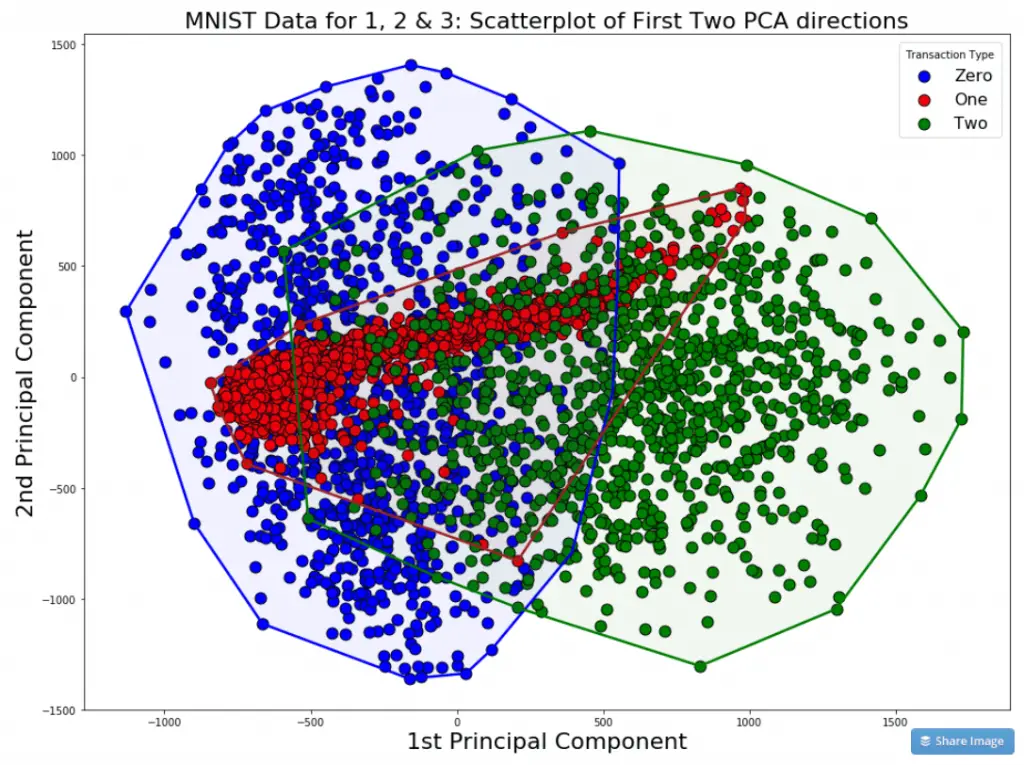 In the picture, though there is a certain degree of overlap, the points belonging to same category are distinctly clustered and region bound. This proves that the data captured in the first two PCs is informative enough to discriminate the categories from each other.
In other words, we now have evidence that the data is not completely random, but rather can be used to discriminate or explain the Y (the number a given row belongs to).
Refer to the 50 Masterplots with Python for more visualization ideas.
6. How to get the original features back
The fitted pca object has the inverse_transform() method that gives back the original data when you input principal components features.
df_orig = pca.inverse_transform(df_pca)
pd.DataFrame(df_orig).round().head()
The above code outputs the original input dataframe.
Part 2: Understanding Concepts behind PCA
To simplify things, let’s imagine a dataset with only two columns. Using these two columns, I want to find a new column that better represents the ‘data’ contributed by these two columns.
This new column can be thought of as a line that passes through these points. Such a line can be represented as a linear combination of the two columns and explains the maximum variation present in these two columns.
In what direction do you think the line should stop so that it covers the maximum variation of the data points? 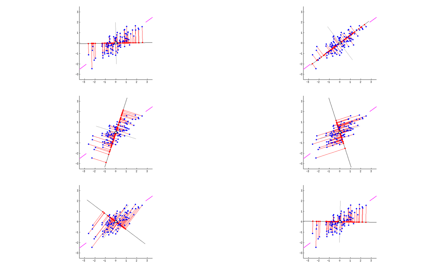 Such a line should be in a direction that minimizes the perpendicular distance of each point from the line. It may look something like this:
 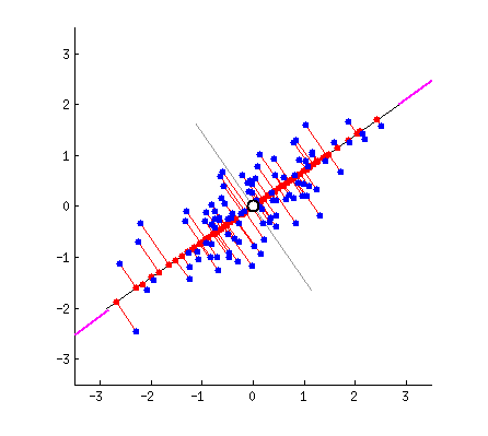 But how to determine this line?
I am only interested in determining the direction(u1) of this line. Because, by knowing the direction u1, I can compute the projection of any point on this line. This line u1 is of length 1 unit and is called a unit vector. This unit vector eventually becomes the weights of the principal components, also called as loadings which we accessed using the pca.components_ earlier.
Remember the PCA weights you calculated in Part 1 under ‘Weights of Principal Components’? It is same as the ”u1′ I am talking about here.
The PCA weights (Ui) are actually unit vectors of length 1. Because, it is meant to represent only the direction.
# PCA weights has length = 1
np.sum(df_pca_loadings.loc[0, :]**2)
#> 0.9999999999999993
7. Objective function of PCA
So, how to find this unit vector (u1)?
Remember, we wanted to minimize the distances of the points from PC1’s direction?
u1 is the unit vector that direction.
To determine u1, we use Pythagoras theorem to arrive at the objective function as shown in pic.
In the pic below, u1 is the unit vector of the direction of PC1 and Xi is the coordinates of the blue dot in the 2d space. Remember, Xi is nothing but the row corresponding the datapoint in the original dataset.
The lengths of the lines can be computed using the Pythagoras theorem as shown in the pic below. 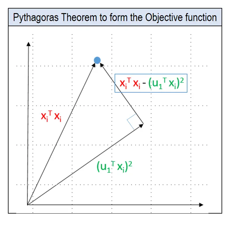
Objective function:
The objective is to determine u1 so that the mean perpendicular distance from the line for all points is minimized. Here is the objective function:  It can be proved that the above equation reaches a minimum when value of
 u1 equals the Eigen Vector of the covariance matrix of X. This Eigen Vector is same as the PCA weights that we got earlier inside pca.components_ object.
We’ll see what Eigen Vectors are shortly.
Alright. But there can be a second PC to this data. The next best direction to explain the remaining variance is perpendicular to the first PC. Actually, there can be as many Eigen Vectors as there are columns in the dataset. And they are orthogonal to each other. 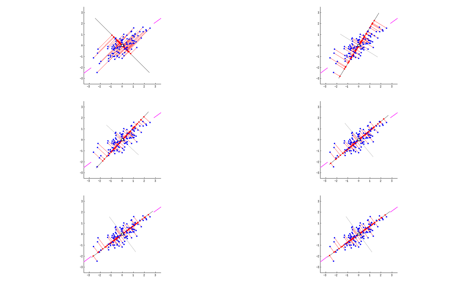 Thanks to this excellent discussion on stackexchange that provided these dynamic graphs.
How to understand the rotation of coordinate axes
Now you know the direction of the unit vector. To compute the Principal components, we rotate the original XY axis of to match the direction of the unit vector.
The Principal components are nothing but the new coordinates of points with respect to the new axes. 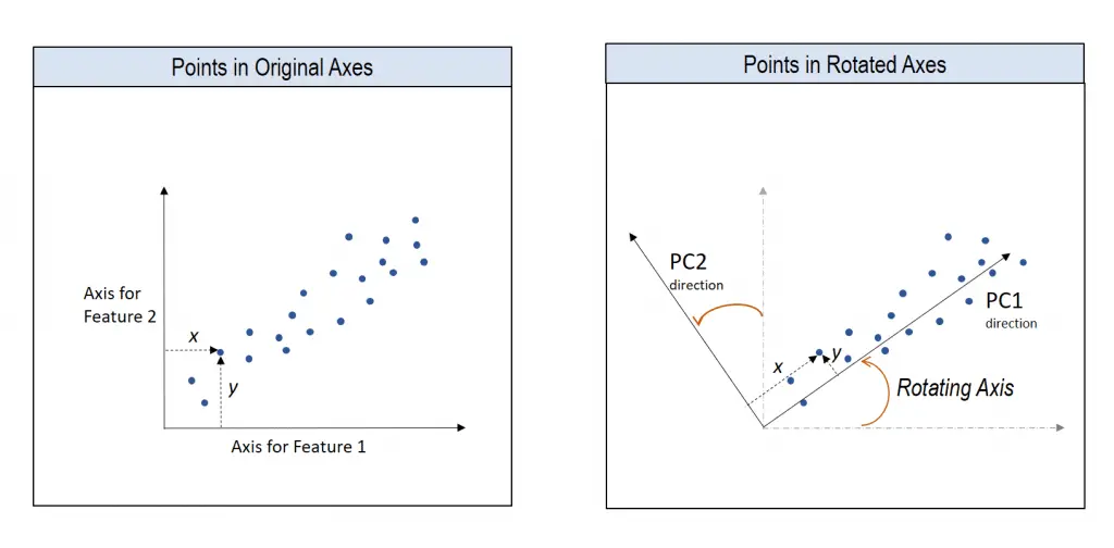
8. What is Eigen Value and Eigen Vector?
If you were like me, Eigenvalues and Eigenvectors are concepts you would have encountered in your matrix algebra class but paid little attention to. Well, Eigen Values and Eigen Vectors are at the core of PCA.
What is Eigen vector?
v is an eigenvector of matrix A if A(v) is a scalar multiple of v. 
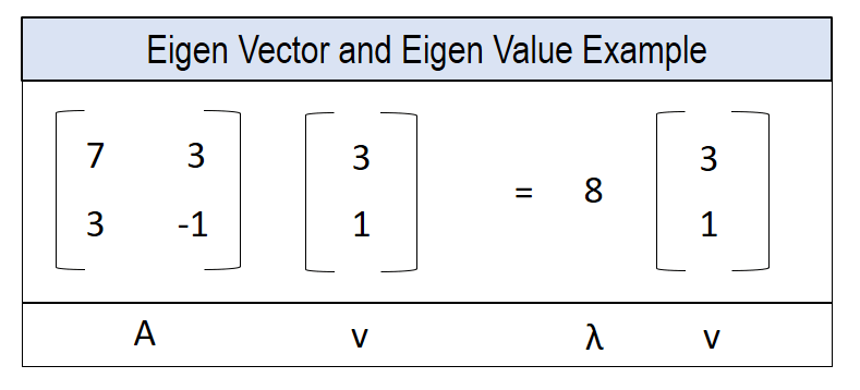 The actual computation of Eigenvector and Eigen value is quite straight forward using the
 eig() method in numpy.linalg module.
Refer to this guide if you want to learn more about the math behind computing Eigen Vectors.
Part 3: Steps to Compute Principal Components from Scratch
9. Import Data
# Import
url = 'https://raw.githubusercontent.com/selva86/datasets/master/mnist_012.csv'
df = pd.read_csv(url)

# Prepare X and Y
Y = df.loc[:, '0']
X = df.drop(['0'], axis=1)

df.head()
Step 1: Standardize each column
Subtract each column by its own mean. As a result, the mean of each column becomes zero.
X_standard = X - X.mean()
X_standard
Step 2 Compute Covariance Matrix
But what is covariance and covariance matrix?
Covariance measures how two variables are related to each other, that is, if two variables are moving in the same direction with respect to each other or not.
When covariance is positive, it means, if one variable increases, the other increases as well. The opposite true when covariance is negative.  The covariance matrix calculates the covariance of all possible combinations of columns.
As a result, it becomes a square matrix with the same number of rows and columns. But, How to actually compute the covariance matrix in Python?
Using pandas dataframe, covariance matrix is computed by calling the df.cov() method.
df_cov = X_standard.cov()
print(df.shape)
df_cov.head()
Step 3: Compute Eigen values and Eigen Vectors
Eigen values and Eigen vectors represent the amount of variance explained and how the columns are related to each other.
The length of Eigenvectors is one.
from numpy.linalg import eig
eigvalues, eigvectors = eig(df_cov)
print(eigvalues[:10])
print(eigvectors.shape)
#> [764074.70509694+0.j 333409.88084323+0.j 206248.30545139+0.j
#>  190073.11430869+0.j 149373.67054257+0.j 140893.79592355+0.j
#>  103478.87643359+0.j  87549.48702637+0.j  82347.51266608+0.j
#>  66776.33611636+0.j]

#> (784, 784)
The j in the above output implies the resulting eigenvectors are represented as complex numbers.
Step 4: Derive Principal Component Features by taking dot product of eigen vector and standardized columns
X_pca = np.dot(X_standard, eigvectors)
df_pca_calc = pd.DataFrame(X_pca)
df_pca_calc.round(2).head()
The result is the Principal componenents, which, is the same as the PC’s computed using the scikit-learn package.
Conclusion
Congratulations if you’ve completed this, because, we’ve pretty much discussed all the core components you need to understand in order to crack any question related to PCA.
PCA can be a powerful tool for visualizing clusters in multi-dimensional data.
Plus, it is also while building machine learning models as it can be used as an explanatory variable as well.
You saw the implementation in scikit-learn, the concept behind it and how to code it out algorithmically as well.


