


Statistics is a domain that revolves around the collection, analysis, interpretation, presentation, and organization of data. To appropriately utilize statistical methods and produce meaningful results, understanding the types of data is crucial.

In this Blog post we will learn
- Qualitative Data (Categorical Data)
1.1. Nominal Data:
1.2. Ordinal Data: - Quantitative Data (Numerical Data)
2.1. Discrete Data:
2.2. Continuous Data: - Time-Series Data:
- Conclusion
Let’s explore the different types of data in statistics, supplemented with examples and visualization methods using Python.
1. Qualitative Data (Categorical Data)
We often term qualitative data as categorical data, and you can divide it into categories, but you cannot measure or quantify it.
1.1. Nominal Data:
Nominal data represents categories or labels without any inherent order, ranking, or numerical significance as a type of categorical data. In other words, nominal data classifies items into distinct groups or classes based on some qualitative characteristic, but the categories have no natural or meaningful order associated with them.
Key Characteristics
- Distinct Categories: Nominal data consists of discrete, non-numeric categories or labels. These categories represent different attributes or classes, but there is no inherent hierarchy or ranking among them.
-
No Quantitative Meaning: Unlike ordinal, interval, or ratio data, nominal data does not imply any quantitative or numerical meaning. The categories are purely qualitative and serve as labels for grouping.
-
Arbitrary Assignment: The assignment of items to categories in nominal data is often arbitrary and based on some subjective or contextual criteria. For example, assigning items to categories like “red,” “blue,” or “green” for colors is arbitrary.
-
No Mathematical Operations: Arithmetic operations like addition, subtraction, or multiplication are not meaningful with nominal data because there is no numerical significance to the categories.
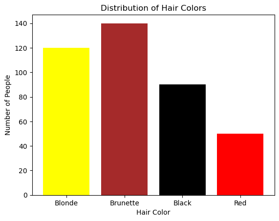
Examples of nominal data include:
- Gender categories (e.g., “male,” “female,” “other”).
- Marital status (e.g., “single,” “married,” “divorced,” “widowed”).
- Types of animals (e.g., “cat,” “dog,” “horse,” “bird”).
- Ethnicity or race (e.g., “Caucasian,” “African American,” “Asian,” “Hispanic”).
import matplotlib.pyplot as plt

hair_colors = ['Blonde', 'Brunette', 'Black', 'Red']
counts = [120, 140, 90, 50]

plt.bar(hair_colors, counts, color=['yellow', 'brown', 'black', 'red'])
plt.title('Distribution of Hair Colors')
plt.xlabel('Hair Color')
plt.ylabel('Number of People')
plt.show()
1.2. Ordinal Data:
Ordinal data is a type of categorical data that represents values with a meaningful order or ranking but does not have a consistent or evenly spaced numerical difference between the values. In other words, ordinal data has categories that can be ordered or ranked, but the intervals between the categories are not uniform or measurable.
Key Characteristics

- Ordered Categories: Ordinal data consists of categories or labels that have a specific order or hierarchy. These categories represent different levels of a qualitative characteristic, but the precise difference between them is not defined.
-
Non-Numeric Labels: The categories in ordinal data are typically represented by non-numeric labels or symbols, such as “low,” “medium,” and “high” for levels of satisfaction or “small,” “medium,” and “large” for T-shirt sizes.
-
No Fixed Intervals: Unlike interval or ratio data, where the intervals between values have a consistent meaning and can be measured, ordinal data does not have fixed or uniform intervals. In other words, you cannot say that the difference between “low” and “medium” is the same as the difference between “medium” and “high.”
-
Limited Arithmetic Operations: Arithmetic operations like addition and subtraction are not meaningful with ordinal data because the intervals between categories are not quantifiable. However, some basic operations like counting frequencies, calculating medians, or finding modes can still be performed.
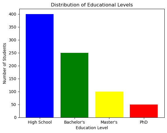
Examples of ordinal data include:
- Educational attainment levels (e.g., “high school,” “bachelor’s degree,” “master’s degree”).
- Customer satisfaction ratings (e.g., “very dissatisfied,” “somewhat dissatisfied,” “neutral,” “satisfied,” “very satisfied”).
- Likert scale responses (e.g., “strongly disagree,” “disagree,” “neutral,” “agree,” “strongly agree”).
education_levels = ['High School', 'Bachelor\'s', 'Master\'s', 'PhD']
students = [400, 250, 100, 50]

plt.bar(education_levels, students, color=['blue', 'green', 'yellow', 'red'])
plt.title('Distribution of Educational Levels')
plt.xlabel('Education Level')
plt.ylabel('Number of Students')
plt.show()
2. Quantitative Data (Numerical Data)
Quantitative data represents quantities and can be measured.
2.1. Discrete Data:
Discrete data refers to a type of data that consists of distinct, separate values or categories. These values are typically counted and are often whole numbers, although they don’t have to be limited to integers. Discrete data can only take on specific, finite values within a defined range.
Key characteristics of discrete data include:
a. Countable Values: Discrete data represents individual, separate items or categories that can be counted or enumerated. For example, the number of students in a classroom, the number of cars in a parking lot, or the number of pets in a household are all discrete data.
b. Distinct Categories: Each value in discrete data represents a distinct category or class. These categories are often non-overlapping, meaning that an item can belong to one category only, with no intermediate values.
c. Gaps between Values: There are gaps or spaces between the values in discrete data. For example, if you are counting the number of people in a household, you can have values like 1, 2, 3, and so on, but you can’t have values like 1.5 or 2.75.
d. Often Represented Graphically with Bar Charts: Discrete data is commonly visualized using bar charts or histograms, where each category is represented by a separate bar, and the height of the bar corresponds to the frequency or count of that category.
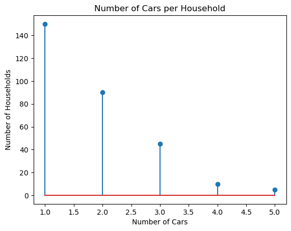
*Examples of discrete data include:
The number of children in a family.
The number of defects in a batch of products.
The number of goals scored by a soccer team in a season.
The number of days in a week (Monday, Tuesday, etc.).
The types of cars in a parking lot (sedan, SUV, truck).
households = list(range(1,6))
cars_owned = [150, 90, 45, 10, 5]

plt.stem(households, cars_owned, use_line_collection=True)
plt.title('Number of Cars per Household')
plt.xlabel('Number of Cars')
plt.ylabel('Number of Households')
plt.show()
2.2. Continuous Data:
Continuous data, also known as continuous variables or quantitative data, is a type of data that can take on an infinite number of values within a given range. It represents measurements that can be expressed with a high level of precision and are typically numeric in nature. Unlike discrete data, which consists of distinct, separate values, continuous data can have values at any point along a continuous scale.
Key Characteristics
- Infinite Values: Continuous data can take on an infinite number of values within a defined range. These values can include decimals, fractions, and any other real numbers.
-
Precision: Continuous data is often associated with high precision, meaning that measurements can be made with great detail. For example, temperature, height, and weight can be measured to multiple decimal places.
-
No Gaps or Discontinuities: There are no gaps, spaces, or jumps between values in continuous data. You can have values that are very close to each other without any distinct categories or separations.
-
Graphical Representation: Continuous data is commonly visualized using line charts or scatter plots, where data points are connected with lines to show the continuous nature of the data.
Examples
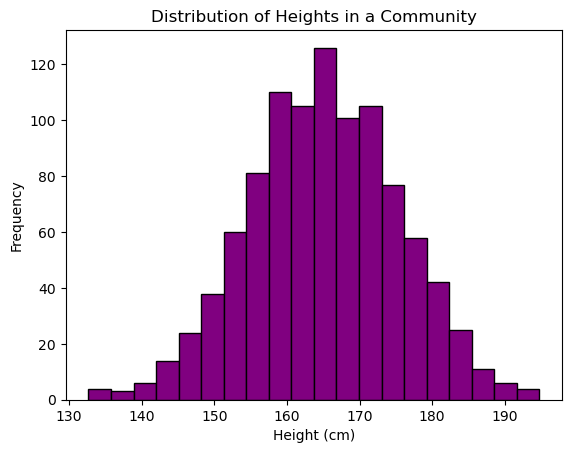
Examples of continuous data include:
- Temperature readings, such as 20.5°C or 72.3°F.
- Height measurements, like 175.2 cm or 5.8 feet.
- Weight measurements, such as 68.7 kg or 151.3 pounds.
- Time intervals, like 3.45 seconds or 1.25 hours.
- Age of individuals, which can include decimals (e.g., 27.5 years).
import numpy as np
heights = np.random.normal(165, 10, 1000) # Sample data with mean=165cm and std_dev=10cm

plt.hist(heights, bins=20, color='purple', edgecolor='black')
plt.title('Distribution of Heights in a Community')
plt.xlabel('Height (cm)')
plt.ylabel('Frequency')
plt.show()
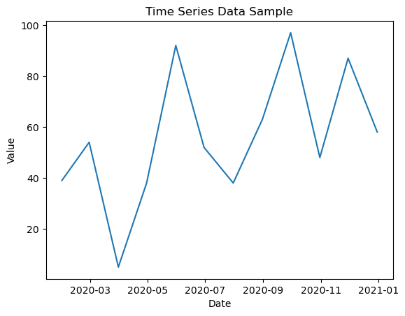
3. Time-Series Data:
Time-series data is a type of data that is collected or recorded over a sequence of equally spaced time intervals. It represents how a particular variable or set of variables changes over time. Each data point in a time series is associated with a specific timestamp, which can be regular (e.g., hourly, daily, monthly) or irregular (e.g., timestamps recorded at random intervals).
Key Characteristics
- Temporal Order: Time-series data is ordered chronologically, with each data point occurring after the previous one. This temporal order is essential for analyzing and modeling time-dependent patterns.
-
Equally Spaced or Irregular Intervals: Time series can have equally spaced intervals, such as daily stock prices, or irregular intervals, like timestamped customer orders. The choice of interval depends on the nature of the data and the context of the analysis.
-
Seasonality and Trends: Time-series data often exhibits seasonality, which refers to repeating patterns or cycles, and trends, which represent long-term changes or movements in the data. Understanding these patterns is crucial for forecasting and decision-making.
-
Noise and Variability: Time series may contain noise or random fluctuations that make it challenging to discern underlying patterns. Statistical techniques are often used to filter out noise and identify meaningful patterns.
-
Applications: Time-series data is widely used in various fields, including finance (stock prices, economic indicators), meteorology (weather data), epidemiology (disease outbreaks), and manufacturing (production processes), among others. It is valuable for making predictions, monitoring trends, and understanding the dynamics of processes over time.
Visualization: Line charts are most suitable for time-series data.
import pandas as pd

# Sample time-series data
date_rng = pd.date_range(start='2020-01-01', end='2020-12-31', freq='M')
df = pd.DataFrame(date_rng, columns=['date'])
df['data'] = np.random.randint(0, 100, size=(len(date_rng)))

plt.plot(df['date'], df['data'])
plt.title('Time Series Data Sample')
plt.xlabel('Date')
plt.ylabel('Value')
plt.show()
4. Conclusion
Understanding the types of data is crucial as each type requires different methods of analysis. For instance, you wouldn’t use the same statistical test for nominal data as you would for continuous data. By categorizing your data correctly, you can apply the most suitable statistical tools and draw accurate conclusions.

