


A probability frequency distribution is a way to describe the likelihood of an outcome. It gives a clear picture of how often an event can happen relative to all possible outcomes. Whether you’re studying data science, statistics, or merely interested in probability, understanding frequency distribution is crucial.

In this Blog post we will learn:
- Types of Probability Frequency Distribution:
- Properties:
- Graphical Representations:
- Uses of Frequency Distributions:
- 1. Probability Frequency Distribution for Discrete Random Variable
5.1. Example : - 2. Probability Frequency Distribution for Continuous Random Variables
6.1. Example : - Conclusion:
1. Types of Probability Frequency Distribution:
- Discrete Probability Distribution: It represents the probability of outcomes for discrete random variables (i.e., those that have a countable number of possible outcomes).
– Examples include the binomial, Poisson, and geometric distributions.
- Continuous Probability Distribution: It represents the probability of outcomes for continuous random variables (i.e., those that have an infinite number of possible outcomes).
– Examples include the normal, exponential, and uniform distributions.
2. Properties:
- The probability of each outcome is between 0 and 1, inclusive.
-
The sum of probabilities for all outcomes equals 1.
3. Graphical Representations:
- Histograms: Especially useful for continuous data, histograms provide bars that show frequency of data in certain intervals.
- Bar Graphs: Ideal for discrete data, each bar represents a distinct value and its height represents its frequency.
- Pie Charts: Give a visual representation of each outcome’s proportion to the whole.
- Probability Mass Function (PMF): For discrete data, PMF gives the probability of each specific outcome.
- Probability Density Function (PDF): For continuous data, PDF represents the likelihood of a value falling within a particular range.
- Cumulative Distribution Function (CDF): Represents the probability that a random variable takes on a value less than or equal to x.
4. Uses of Frequency Distributions:
-
Data Understanding: At a glance, these distributions provide a clear picture of the data’s distribution. For instance, is it skewed? Are there outliers?
-
Data Preprocessing: Before applying machine learning algorithms, it’s crucial to understand the dataset’s distribution. This can help in normalizing the data, handling outliers, or even selecting the most appropriate algorithm.
-
Hypothesis Testing: If you know the distribution of your data, you can determine which statistical tests are applicable. Some tests assume normal distribution, while others might be non-parametric.
-
Communication: Visual distributions like histograms and bar charts derived from frequency distributions are fantastic for presentations and reports. They communicate complex data trends in a simple, digestible manner.
5. 1. Probability Frequency Distribution for Discrete Random Variable
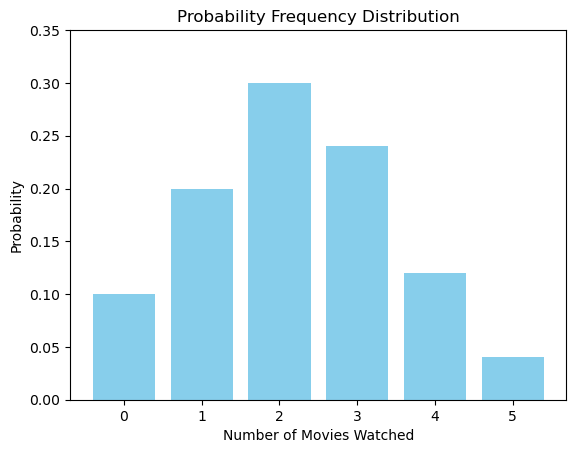
5.1. Example :
Assume you conducted a survey asking 50 students the number of movies they watched last month. The results are as follows:
| Number of Movies (x) | Number of Students (f) |
|---|---|
| 0 | 5 |
| 1 | 10 |
| 2 | 15 |
| 3 | 12 |
| 4 | 6 |
| 5 | 2 |
To find the probability distribution:
$ P(X = x) = \frac{f}{\Sigma f} $
Where:
– $ P(X = x) $ is the probability of the random variable $ X $ taking on the value $ x $.
– $ f $ is the frequency of $ x $ (number of students who watched x movies).
– $ \Sigma f $ is the total number of observations (50 in this case).

# Data
x_values = [0, 1, 2, 3, 4, 5]
probabilities = [0.10, 0.20, 0.30, 0.24, 0.12, 0.04]

# Plotting
import matplotlib.pyplot as plt

plt.bar(x_values, probabilities, color='skyblue')
plt.xlabel('Number of Movies Watched')
plt.ylabel('Probability')
plt.title('Probability Frequency Distribution')
plt.xticks(x_values)
plt.ylim(0, 0.35)  # Setting y-axis limit for better visualization
plt.show()
6. 2. Probability Frequency Distribution for Continuous Random Variables
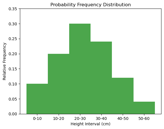
6.1. Example :
We took measurements of the height of plants in a garden and grouped the results into intervals. The data is as follows:
| Height Interval (cm) | Number of Plants (f) |
|---|---|
| 0-10 | 5 |
| 10-20 | 10 |
| 20-30 | 15 |
| 30-40 | 12 |
| 40-50 | 6 |
| 50-60 | 2 |
We will visualize the data using a histogram where the height of each bar represents the relative frequency of the measurements within each interval.
# Data
intervals = ["0-10", "10-20", "20-30", "30-40", "40-50", "50-60"]
relative_frequencies = [0.10, 0.20, 0.30, 0.24, 0.12, 0.04]
midpoints = [5, 15, 25, 35, 45, 55]  # for x-axis placement

# Plotting
import matplotlib.pyplot as plt

plt.bar(midpoints, relative_frequencies, width=10, align='center', alpha=0.7, color='green')
plt.xlabel('Height Interval (cm)')
plt.ylabel('Relative Frequency')
plt.title('Probability Frequency Distribution')
plt.xticks(midpoints, intervals)
plt.ylim(0, 0.35)  # Setting y-axis limit for better visualization
plt.show()
7. Conclusion:
Understanding and visualizing probability frequency distributions is essential for various applications from predicting future events, estimating risks, to making decisions under uncertainty.
Python, with its rich libraries like NumPy and Matplotlib, provides a simple yet powerful platform for anyone keen on diving into the world of probability and statistics. So, harness this knowledge, and make your data speak the language of probability!

