Boxplot is a chart that is used to visualize how a given data (variable) is distributed using quartiles. It shows the minimum, maximum, median, first quartile and third quartile in the data set.
What is a boxplot?
Box plot is method to graphically show the spread of a numerical variable through quartiles.
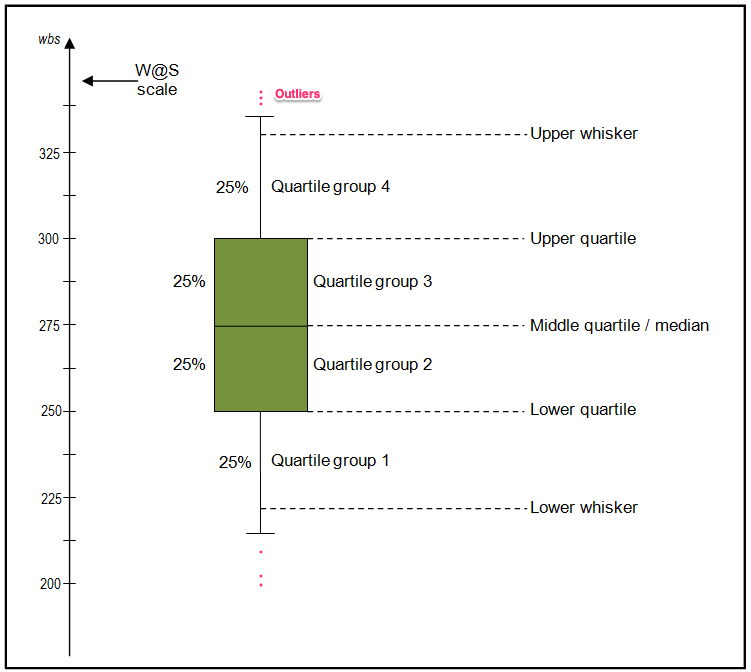
From the below image you can see what information we generally get from a box plot.
How to interpret the box plot?
The bottom of the (green) box is the 25% percentile and the top is the 75% percentile value of the data.
So, essentially the box represents the middle 50% of all the datapoints which represents the core region when the data is situated. The height of the boxplot is also called the Inter Quartile Range (IQR), which mathematically is the difference between the 75th and 25th percentile values of the data.
The thick line in the middle of the box represents the median. Whereas, the upper and lower whisker marks 1.5 times the IQR from the top (and bottom) of the box.
But, why whiskers matter?
Because, the points that lie outside the whiskers, that is, (1.5 x IQR) in both directions are generally considered as outliers.
Lets create an artificial dataset and visualize the data using box plot. For creating an artificial dataset I used random.rand() command from numpy which generates random values between 0-1 to each element in the array.
And I speciified the length of the Dataframe to be 50×3 as argument in the function
import pandas as pd
import numpy as np
df = pd.DataFrame(np.random.rand(50, 3), columns=['A', 'B', 'C'])
df.head()
| A | B | C | |
|---|---|---|---|
| 0 | 0.160039 | 0.288336 | 0.489377 |
| 1 | 0.947344 | 0.897678 | 0.356333 |
| 2 | 0.486124 | 0.928932 | 0.263846 |
| 3 | 0.022501 | 0.700835 | 0.298088 |
| 4 | 0.742429 | 0.503843 | 0.296938 |
The dataset contains 50 randomly selected values between 0-1 in each column.
Looking into this data and finding it’s distribution will take an ample amount of time, that’s where using a distribution plot like boxplot comes in handy.
Basic boxplot using pandas library
Since we are dealing with a pandas data frame, you can create the boxplot using the pandas library directly.
df is the DataFrame we created before, for plotting boxplot we use the command DataFrame.plot.box().
# Boxplot with Pandas
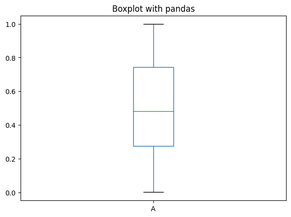
df.plot.box(title='Boxplot with pandas');
From this you can see the median value for each distribution and also the different quartile groups.
Plotting a boxplot using matplotlib
For using matplolib, first you need to import the matplotlib library. If you want you can alter the default parameters by using the function plt.rcParams.update() function.
Then, use plt.boxplot(data) for plotting the data.
# Load package
import pandas as pd, numpy as np
import matplotlib.pyplot as plt
%matplotlib inline
plt.rcParams.update({'figure.figsize':(7,5), 'figure.dpi':100})

# Creating dataset
df = pd.DataFrame(np.random.rand(500, 1), columns=['A'])

# plot
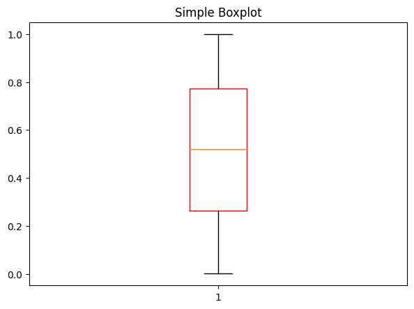
plt.boxplot(df['A'], boxprops=dict(color='red'))
plt.title('Simple Boxplot');
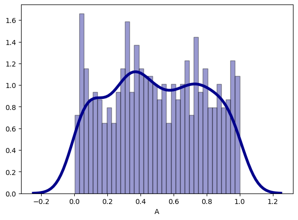
Alternately, you can visualize the distribution with a combination of histogram and density plot. This is straightforward to create with seaborn.
# Histogram and density
import seaborn as sns

sns.distplot(df['A'], hist=True, kde=True,
             bins=int(180/5), color = 'darkblue',
             hist_kws={'edgecolor':'black'},
             kde_kws={'linewidth': 4});
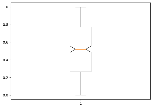
Notched Boxplot in matplotlib
The notched boxplot allows you to evaluate confidence intervals (by default 95% confidence interval) for the medians of each boxplot.
To create the notch, set notch=True in the plt.boxplot function.
# Notched box plot
plt.boxplot(df['A'],notch=True);
Plotting boxplot using seaborn
Lets look into an existing dataset – Titanic Dataset
This dataset contains the data of whether the person has survived or not during the sink of titanic and different details of the person.
You can download the below used dataset from the link: https://github.com/ven-27/datasets/blob/master/titanic.csv
# Import data
df=pd.read_csv("https://raw.githubusercontent.com/ven-27/datasets/master/titanic.csv")
df.head()
We can see that the dataset contains information of passengers of the Titanic and the Survived column shows whether they survived or not. Now let’s look into the distribution of survived based on the age of the passenger.
We use the function sns.boxplot() to plot the box plot in seaborn library.
# Boxplot with Seaborn
import seaborn as sns
sns.set_style('whitegrid')
ax= sns.boxplot(x='Survived',y='Age',data=df)
ax = sns.stripplot(x="Survived", y="Age",data=df)
The stripplot() function adds the dots, which clearly gives more info on the distribution of points. In this case, the distribution appears to be fairly uniform, but we can’t say for sure with just this. A violin plot may help here (in section below).
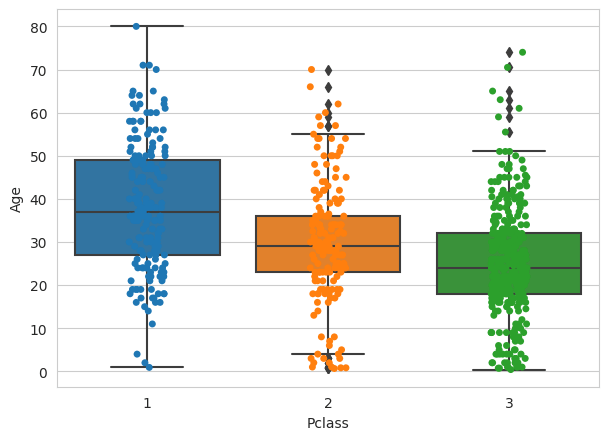
Plot Passenger Class (Pclass) by Age.
sns.set_style('whitegrid')
ax= sns.boxplot(x='Pclass',y='Age',data=df)
ax = sns.stripplot(x="Pclass", y="Age",data=df)
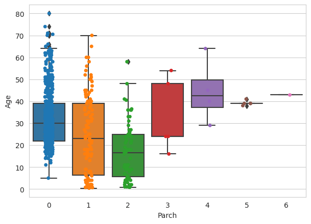
Plot Parch by Age.
sns.set_style('whitegrid')
ax= sns.boxplot(x='Parch',y='Age',data=df)
ax = sns.stripplot(x="Parch", y="Age",data=df)
Interpretation from the above graphs
Using the graph you can see distribution of Age for Passenger Class – 1,2,3 and whether the person has survived or not.
You can also see where the ‘cream of the data’ is situated by the location of the box. There are multiple outliers as well in ‘Age’ when split by Parch.
These are characterised by points that lie outside the whiskers.
From the above boxplot with the distribution, we can see that the median age for a person in first class is around 38 and for a person in second class is 29 and for a person in third class is around 24.
It seems to imply that older people tend to travel in upper classes.
sns.set_style('whitegrid')
ax= sns.boxplot(x='Pclass',y='Age',data=df,notch=True)
ax = sns.stripplot(x="Pclass", y="Age",data=df)
We can also say that since the notches of the boxplots do not coincide with each other, we can conclude with 95% confidence interval that the medians differ for all 3 classes.
Violin Plot – A different kind of distribution finding graph
Instead of using the boxplot, we can also draw the violin plot which also shows the distribution by using the fucntion sns.violinplot(x=' ', y=' ',Data=df).
The width of the violin is wider in places where there is more concentration of data points.
import seaborn as sns
sns.set_style('whitegrid')
ax= sns.violinplot(x='Survived',y='Age',data=df)
ax = sns.stripplot(x="Survived", y="Age",data=df)
The above graph shows the distribution of Age vs whether the person has survived or not using violin plot.


