Line plot is a type of chart that displays information as a series of data points connected by straight line segments. A line plot is often the first plot of choice to visualize any time series data.
Contents
- What is line plot?
- Simple Line Plot
- Multiple Line Plot in the same graph
- Creating a secondary axis with different scale
- Line plot for Time series Analysis
- Different styles in Line plot
- Highlighting a single line out of many
- Practice Datasets
1. What is line plot?
Line plot is a type of chart that displays information as a series of data points connected by straight line segments.
Line plots are generally used to visualize the directional movement of one or more data over time. In this case, the X axis would be datetime and the y axis contains the measured quantity, like, stock price, weather, monthly sales, etc.
A line plot is often the first plot of choice to visualize any time series data.
First let’s set up the packages to create line plots.
# Load Packages
import matplotlib.pyplot as plt
import numpy as np
import pandas as pd
plt.style.use('seaborn-whitegrid')
plt.rcParams.update({'figure.figsize':(7,5), 'figure.dpi':100})
%matplotlib inline
2. Simple Line Plots
Let’s create a dataset with 50 values between 1 and 100 using the np.linspace() function. This will go in the X axis, whereas the Y axis values is the log of x.
The line graph of y vs x is created using plt.plot(x,y). It joins all the points in a sequential order.
# Simple Line Plot
x=np.linspace(1,100,50)
y=np.log(x)
plt.plot(x,y)
plt.xlabel('x')
plt.ylabel('logx')
plt.title('Simple Line Plot')
plt.xlim(0,100)
plt.ylim(0,5)
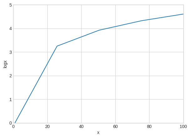
Let’s reduce the number of datapoints to five and see how it looks.
# Simple line plot with lesser points
x=np.linspace(1,100,5)
y=np.log(x)

# Plot
plt.plot(x,y)

# Decorate
plt.xlabel('x')
plt.ylabel('logx')
plt.xlim(0,100)
plt.ylim(0,5)
plt.show()
If we look closely into the graph by reducing the number of data points you can see that the points are actually joined by line segments.
3. Multiple Line Plots in a same graph
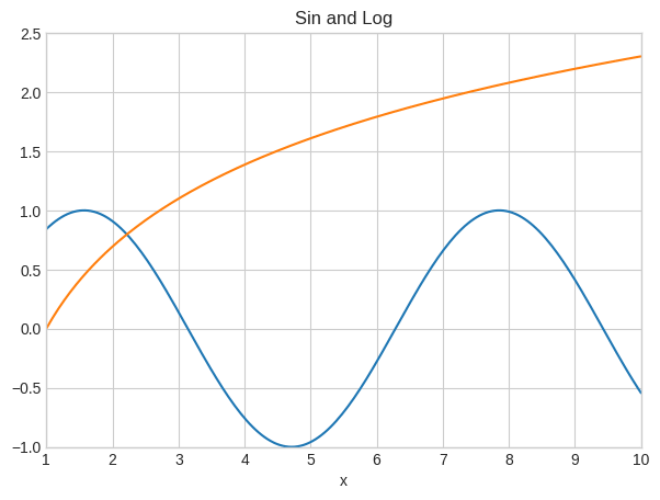
To make multiple lines in the same chart, call the plt.plot() function again with the new data as inputs.
# Multiple lines in same plot
x=np.linspace(1,10,200)

# Plot
plt.plot(x, np.sin(x))
plt.plot(x,np.log(x))

# Decorate
plt.xlabel('x')
plt.title('Sin and Log')
plt.xlim(1,10)
plt.ylim(-1.0 , 2.5)
plt.show()
In the above graph, I have plotted two functions – sin(x) and log(x) in the same graph.
4. Plot two lines in two different Y axes (secondary axis)
Sometimes the the data you want to plot, may not be on the same scale.
For example, you want to plot the number of sales of a product and the number of enquires. Here, sales data could be in 10’s whereas the number of sales enquiries could be in 100’s. Still you want to compare their tandem movement by plotting both these lines in same chart.
It’s possible to plot for 2 different y axis(left and right) with different scales.
You can do this by using the twinx() function in python.
That is, after plotting the first chart using ax1, you can get the reference for the second Y axis (ax2) using the twinx() method of ax1.
# Plot second line in secondary Y axis.
x = np.arange(1, 10, 0.1)
y1 = np.exp(x)
y2 = np.log(x)

# Plot
fig, ax1 = plt.subplots()
ax1.set_ylabel('exp')
ax1.plot(x, y1, color='blue')
ax1.set_ylim(0,40000)
ax1.grid()

# Second Line on secondary Y axis
ax2 = ax1.twinx()  # join a second axis with the first graph we just made
ax2.set_ylabel('log')
ax2.set_ylim(0,3)
ax2.plot(x, y2,color='red')
plt.show()
You can see that on both sides of the plot, there are different scales and each colour represents different functions.
5. Line Plots for Time series Analysis
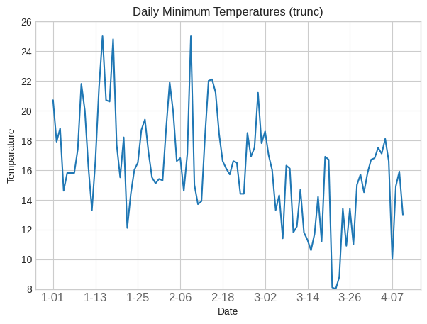
Lets plot a real time series based on a dataset containing the Temparature values during the time period of 1981-1990.
# Import Data
import pandas as pd
# df=pd.read_csv("mintemp.csv",parse_dates=True)
df=pd.read_csv("https://raw.githubusercontent.com/jbrownlee/Datasets/master/daily-min-temperatures.csv")
df.head()
| Date | Temp | |
|---|---|---|
| 0 | 1981-01-01 | 20.7 |
| 1 | 1981-01-02 | 17.9 |
| 2 | 1981-01-03 | 18.8 |
| 3 | 1981-01-04 | 14.6 |
| 4 | 1981-01-05 | 15.8 |
Lets take only the first 100 values for plotting the line plot, because if we consider too many points the graph will become crowded and we will not be able to visualize the graph properly.
# Time Series Line Plot
df=df[:100]

# Plot
plt.plot(df['Date'],df['Temp'])

# Decorate
xtick_location = df.index.tolist()[::12]
xtick_labels = [x[-4:] for x in df.Date.tolist()[::12]]
plt.xticks(ticks=xtick_location, labels=xtick_labels, rotation=0, fontsize=12, horizontalalignment='center', alpha=.7)
plt.title('Daily Minimum Temperatures (trunc)')
plt.xlabel('Date')
plt.ylabel('Temparature')
plt.ylim(8 , 26)
(8.0, 26.0)
6. Different styles in Line Plot
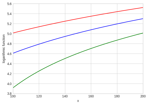
I have created a dataset with values of x ranging from 100 to 200 with 500 datapoints.
Then I plotted it versus log(x), log(x-50) and log(x+50) by joining all the corresponding values for each point.
# Multiple line plots
x=np.linspace(100,200,500)

# Plot
plt.plot(x, np.log(x), color='blue')
plt.plot(x, np.log(x-50), color='green')
plt.plot(x,np.log(x+50),color='red')

# Decorate
plt.xlabel('x')
plt.ylabel('logarithmic function');
plt.xlim(100,200)
plt.ylim(3.8, 5.6)
(3.8, 5.6)
You can see that the colour can be changed by using the color=” fucntion in matplotlib library.
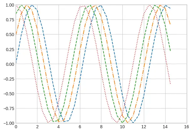
# Change line style
x=np.arange(0,15,0.5)

# Plot
plt.plot(x, np.sin(x), linestyle='dashed')
plt.plot(x, np.sin(x+0.5), linestyle='dashdot');
plt.plot(x, np.sin(x+1.0),linestyle = '--')
plt.plot(x, np.cos(x),linestyle=':')

# Decorate
plt.xlim(0,16)
plt.ylim(-1.00, 1.00)
(-1.0, 1.0)
You can also change the linestyle by using the function linestyle=” in matplotlib library.
7. How to highlight a single line out of many in python plot
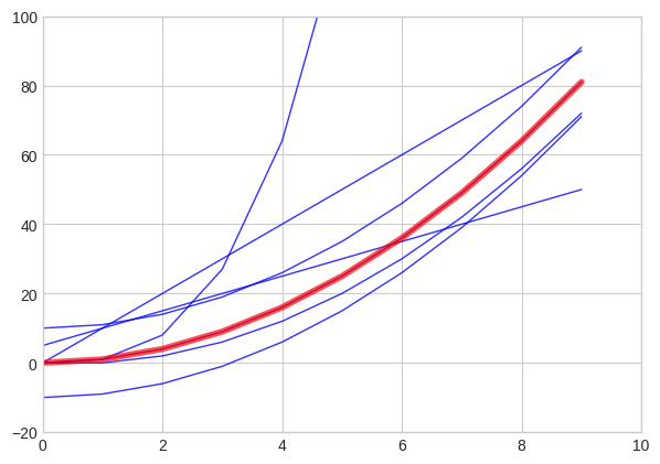
This graph allows the reader to understand your point quickly, instead of struggling to find the important line in a series of lines.
First you need to print all the graphs with discrete lines, then print the important plot again with strongly visible lines.
import matplotlib.pyplot as plt
import numpy as np
import pandas as pd
x=np.arange(0,10,1)
df = pd.DataFrame({'x': x, 'y1': (x*x) ,'y2': (x*x -10) , 'y3':(5 * x + 5), 'y4': (x*10),'y5':(x*x +10),'y6':(x*x*x),'y7': x*x-x})
for column in df.drop('x', axis=1):
   plt.plot(df['x'], df[column], color='blue',linewidth=1,alpha =0.8)
plt.xlim(0,10)
plt.ylim(-20,100)
plt.plot(df['x'], df['y1'], color='red', linewidth=4, alpha=0.7);
You can see that the x^2 plot has been highlighted in the above graph.
8. Practice
You can try plotting line plots for these below mentioned time series data for practice:
Air Quality Dataset – DESCRIPTION
Absenteesm Dataset – DESCRIPTION
You can find more datasets to practice here.


